


Overview
Harbor is a mental health application that provides users with the support they need, personalized to work in combination with therapy and/or medication. The application includes features that let users complete tasks assigned to them, track their medications, journal, and build communities with people on the same journey as them.


Role
UX Researcher
UX Designer
Information Architect
UI Designer
Tools
Adobe XD
InVision
Figma
Marvel
Project Scale
3 months
Problem Statement
People struggling with mental health issues usually need help and support besides their therapist/medication as they go through the journey of getting better and oftentimes this support cannot be found in their immediate environment.
Proposed Solution
An application designed to provide that support for people by helping them form connections, guide them through resources, and help them stay motivated on their path towards mental wellness. Utilizing ways such as setting goals, tracking activity, and daily reminders for tasks to keep users engaged. The interface has to be user-friendly and avoid an overwhelming amount of information by creating personalized views catered toward the individual user's needs and goals.
Solution Approach
Design thinking is a solution-based approach to fostering innovative outcomes to complex problems. The purpose of using this process for Harbor is to put design at the forefront of the application which in turn will lead to creating a user-friendly application. This process is not linear and the stages can be jumped around or repeated as many times as needed.

Competitive Analysis
Here I worked on identifying the potential competitors for Harbor in the market right now and narrowed it down to the top two competitors in order to perform a detailed analysis based on their usability, layout, navigation structure, compatibility, differentiation, and calls to action.


Performing the SWOT analysis helped me understand the scope Harbor has in the market to bring forward features, improvements, and experiences that don't already exist in these top competitors.
User Research
In order to further understand the scope of Harbor, it was essential to understand experiences with existing applications from the users themselves. I used the research methods of surveying and user interviewing to gain insight into user behaviors, needs, frustrations, and feelings towards mental health apps.
Research Goals
-
Understanding user pain points in using other mental health applications
-
Understanding the scope for improvement in existing applications
-
Finding what features users find helpful in existing mental health applications
-
Finding if users find online support or more so in-person help to be more beneficial in their journey
-
Assessing value and the level of support provided by the popular means of support provided by existing apps
I created this affinity map to analyze the target audience's current awareness and usage of existing apps dealing with anxiety, depression, mental health, and therapy in general. I grouped observations into clusters based on interviews and responses I received on the interview questions and this google survey
Affinity Map

User Persona and Journey Map
Based on the user research, I created these two personas with different scenarios and user stories that would benefit from using Harbor for support.
Persona 1

Persona 2

Journey Map

User Journey

Building these personas and building journeys for specific scenarios helped evaluate different goals and needs to design an app that is inclusive of all criteria to satisfy users.
User Flows
Next, creating these user flow diagrams helped me map out the easiest process of navigation that users would go through in order to complete different tasks using the app.

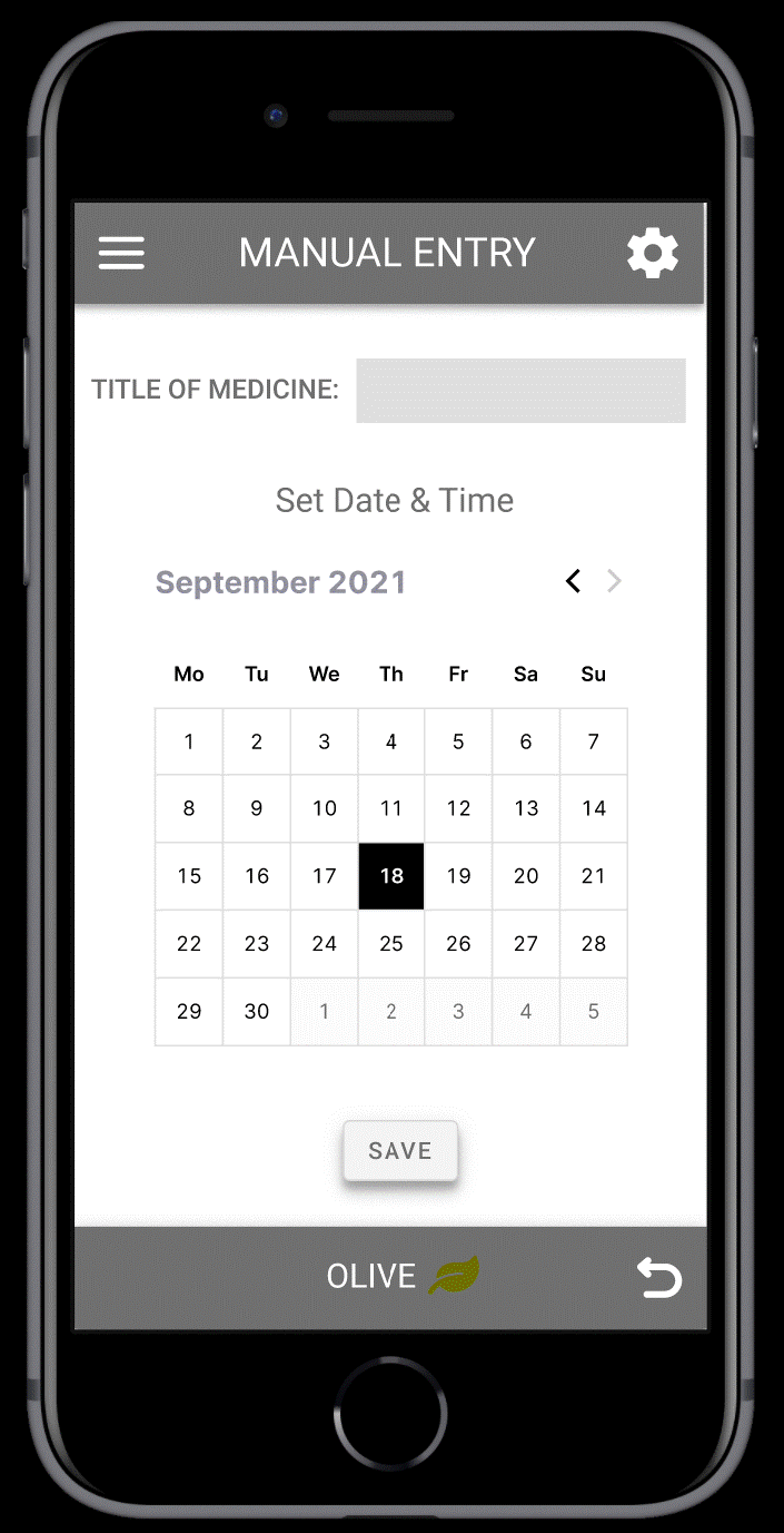
This user flow shows the navigation steps that a user would go through for creating a medication schedule using Harbor.

create journal entry
Here the user flow shows the process of navigation for a user to create a journal entry and share it with their doctor if they wish to do so.
Sitemap
After mapping out the user flows I put together this sitemap which outlines the overall hierarchy of the application from broader to more detailed navigation through the pages.

Low-Fidelity Prototype
Next, I sketched out wireframes and grouped together a user flow to display what the pages and base functionality would look like for the task of creating a new medication schedule on the app.

Mid-Fidelity Prototype
Using the low-fidelity wireframes as a reference I added a bit more detail and digitalized the design from the paper sketches using Adobe XD. I then created a mid-fidelity prototype using InVision.
The prototype made it easy to share with users during the next phase which is user testing and making rapid changes in the design based on the feedback received. You can check out the mid-fidelity clickable prototype here


User Testing
I recruited 6 participants for testing the application on the basis of Jakob Nielson's five usability components: learnability, efficiency, memorability, errors, and satisfaction. I created a test plan and script for the set of questions I will be asking users to answer and the tasks they will be performing. During the test, users were asked to navigate the prototype for completing the tasks. Based on the user testing I made an affinity map and a rainbow spreadsheet to analyze the observations and revise the app.
Affinity Map
High-Fidelity Wireframes

Rainbow Spreadsheet

Style Guide
Here are all the included elements used to build Harbor, from the color palette, and typography, to the buttons, and icons being used on the application. The style guide facilitates ease in any modifications that need to be made in the future.
Color Palette
Text Styles


Icons
Buttons

94 x 24
284 x 72
284 x 48
94 x 27
100 x 27
200 x 32
284 x 72
284 x 48
216 x 56
70 x 48
284 x 72
96 x 32
96 x 32
77 x 22
Refinement and High-Fidelity Prototype
Having analyzed the user test results, I implemented those design changes. I then worked on improving the visual design and overall usability of the application based on ideas from Gestalt Properties, Gestalt Laws of Grouping, and Principles of Design. After the iterative process of prototyping, testing, analyzing, and refining the application I finalized the changes in the wireframes and created the high-fidelity clickable prototype for Harbor.


Harbor Prototype Walkthrough
Key UX Insights
-
Working in this process has helped me improve my skills as a UX designer and taught me that every design you create is not final. Regardless of the time and effort you put in things don’t work out your way and learning to react efficiently in this situation and being willing to start over is very important as a designer
-
Given more time, I would continue to develop more details on the features of the application and go through the iterative process of testing and refining to evaluate the final design before sending it to the development phase
-
It is also important to continue to improve the design, so based on user reviews and ratings on the apps I will work on periodical updates in the design as needed
Thank You!
